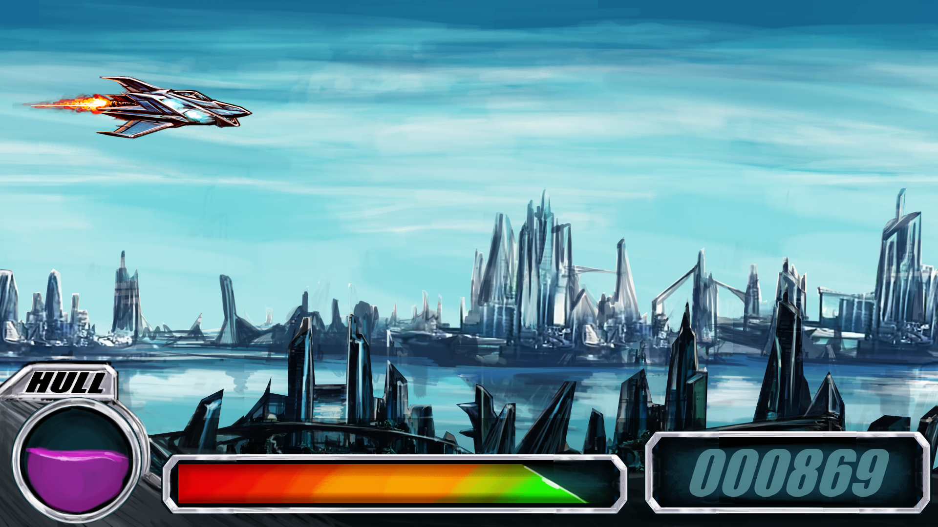
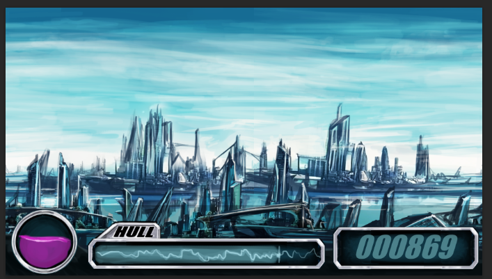
The User Interface in a game is just as important as the gameplay. The User Interface (UI) communicates key information to the player and without it, the player can’t keep track of resources they have to use. Initially Lewis Sanderson looked at similar games in the genre such as R-Type and created some mock ups, considering colours, positioning, and fonts. With these first concepts, we were trying to create an industrial style and theme matching the ship design.

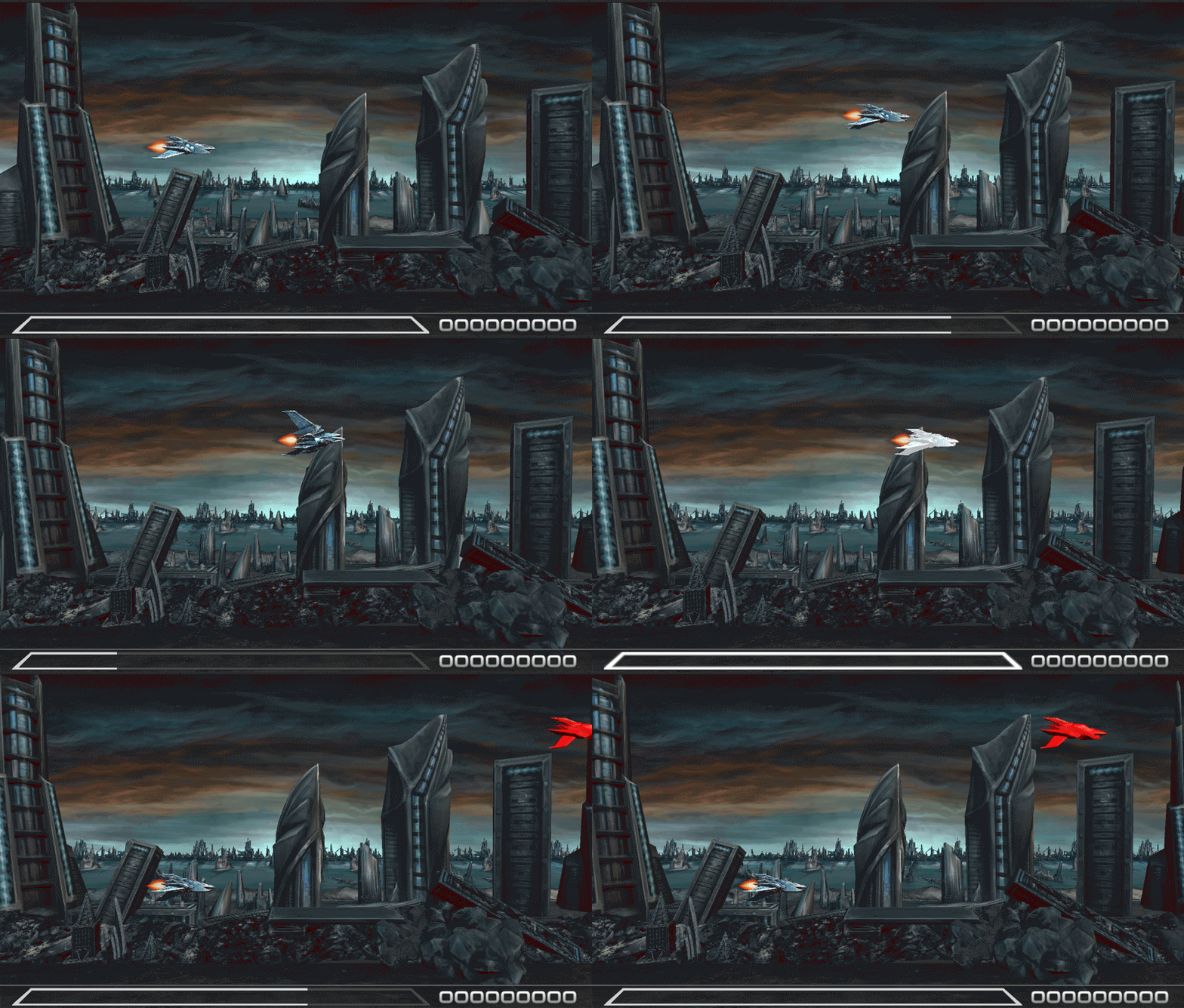
We held on to these initial concepts and focused on refining the core gameplay so that we knew exactly what information we needed to display to the player. The core gameplay actions we settled on for the player was moving, shooting, and a dodge. You can see the difference between the initial designs where we dropped the ship health in favour of a arcade style “one-hit-kill” and shrunk a lot of the elements for more gameplay space and reduced the visual noise. For this part of the design, our method was to take a screenshot of the game and iterate on the designs.

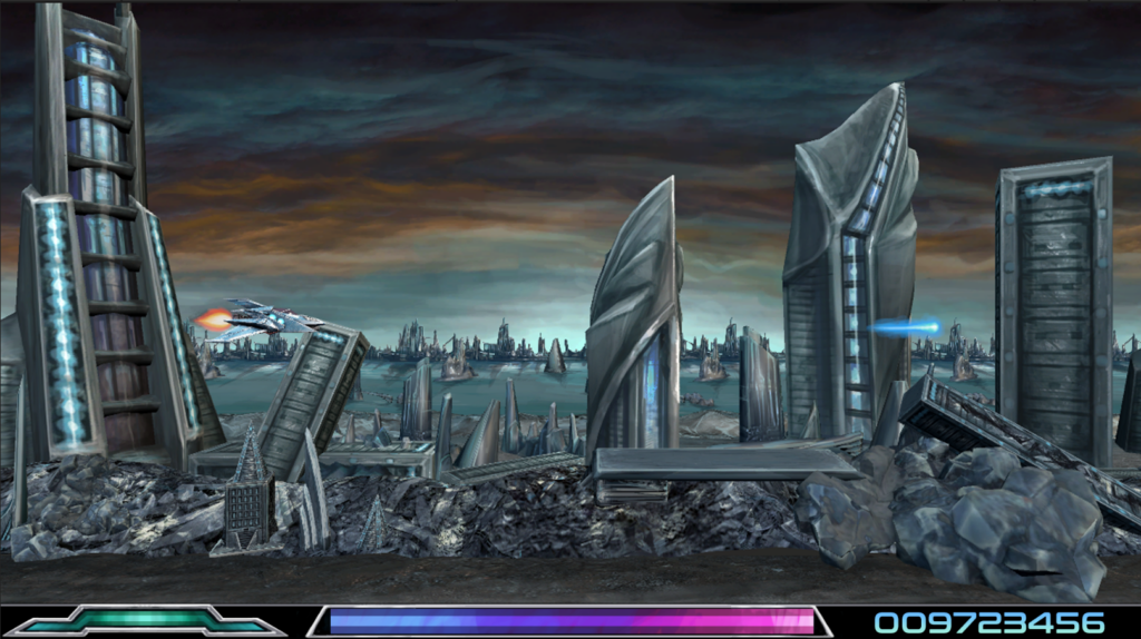
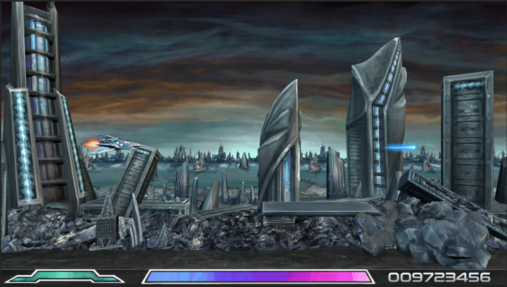
We went through several ideas here. The key information we wanted to communicate with the player is:
- Charge meter (destroying enemies will build up a gauge which the player can use for a charged shot)
- Dodge meter (the player can dash to dodge enemies and absorb projectiles to add to their charge meter)
- Score
Initially, we had a green bar for the dodge, making the shape more of a “wing” to convey the dodging to the player and added the charge bar in the centre with a changing colour. We settled on the charge shot being a purple laser early on so we wanted the charge bar to reflect that in some way. We looked at League of Legends for this one where the colour changes over the size of the bar.

The shapes were changed but overall it felt too cluttered and during testing the dodge bar wasn’t obvious to the player with what it was trying to communicate.
Combining the two bars during testing was well received. I made the outer area of the bar the dodge and made the edges thicker to make it clearer that it was an gauge rather than a border. It was a step in the right direction but the shape didn’t fit the aesthetics of the game with the rounded shapes rather than sharper edges of the rest of the game and the ship designs.
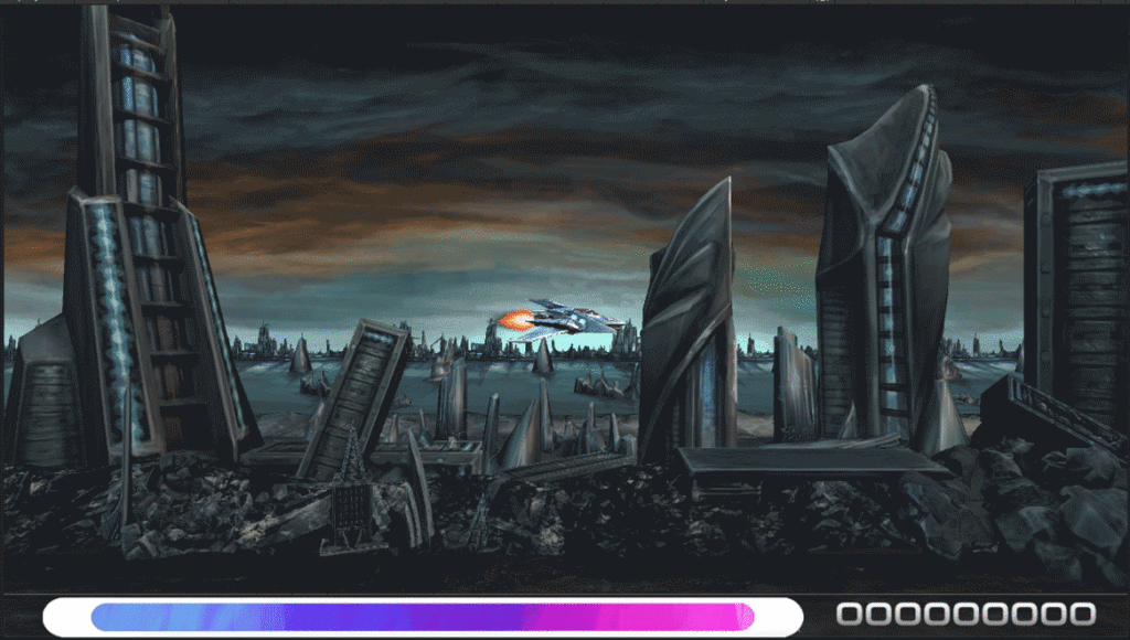
Finally we shrunk the border and I added a flash to the ship itself to indicate that the dodge ability had recharged. This meant the player could focus their attention on the game rather than looking at the bottom of the screen.
